Front Spare Room Redo
As I had been decorating the condo, I was also starting to redo my front spare room.
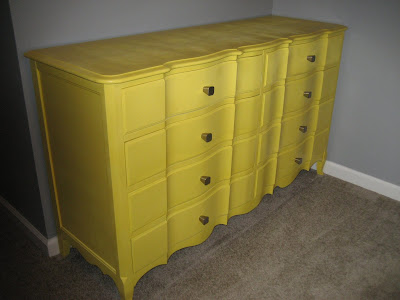
Before it was yellow and gray.

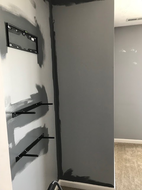
I took out the dresser and nightstands and got a new duvet cover and added some floating shelves and hung the tv on the wall opposite of the bed.

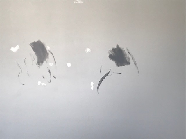
You can see here I already started to fill in the nail holes from all the things that were hung in there. The gallery wall was a mess. There were a LOT of holes that needed to be filled. Once that was done- I headed to pick up some new paint for the walls and the furniture. And since you all know me- it didn't matter that it was 9pm at night- I wanted to see what the wall color looked like. I went slightly darker than the gray that was on the walls.

And I hated it. It gave off a purple vibe. It was definitely not what I was going for. So I headed back the following weekend to replace it- going with my go-to gray, the one that is already in my master bedroom and the other spare room. I mean, I'm nothing if not consistent.


Side by side comparison, the one on the right is my go to color. The one on the left is the gross one. My go to has a more black undertone to it. I love it. Should have just gone with that one in the first place.
Now that I knew I was keeping that color- I spent the day clearing out the room and putting the new color on the walls.


I mean, you can clearly see how much darker the new color is than the old. It's so moody, just like me. That's why I love it so much. It reminds me of my love of thunderstorms.


Finished and dry.


See what I mean when I say they are very similar to each other?

And here is the duvet cover. I had a few options for furniture color. I definitely didn't want aqua furniture. I'm OVER aqua. So it was mint, coral, raspberry, or navy. I felt if I went with mint or coral the room would be very girly- almost teenager girly. The raspberry color is really pretty, but I felt decorating the room around that color would be almost impossible. I also try in my house to not make it overly feminine. I mean, aside from the hot pink linen closet, my house is very masculine in colors. I felt the grayish navy was the best option but with the darker furniture, it would ground the room more than the mint/aqua/coral.


So the plan this weekend is to get the nightstands and mirror sanded and painted. Then I have to figure out what artwork I want to put into the frames that were originally in the room. If you remember those, I had old magazine pin-up pics in them. Again, not the theme I'm going with this time around.


This time around all 6 will be on the closet wall- the top photo of these three. I have an idea of what I want in them, I just need to figure out how I'm going to go about it and choosing the photos. Stay tuned.
Before it was yellow and gray.


I took out the dresser and nightstands and got a new duvet cover and added some floating shelves and hung the tv on the wall opposite of the bed.

You can see here I already started to fill in the nail holes from all the things that were hung in there. The gallery wall was a mess. There were a LOT of holes that needed to be filled. Once that was done- I headed to pick up some new paint for the walls and the furniture. And since you all know me- it didn't matter that it was 9pm at night- I wanted to see what the wall color looked like. I went slightly darker than the gray that was on the walls.

And I hated it. It gave off a purple vibe. It was definitely not what I was going for. So I headed back the following weekend to replace it- going with my go-to gray, the one that is already in my master bedroom and the other spare room. I mean, I'm nothing if not consistent.

Side by side comparison, the one on the right is my go to color. The one on the left is the gross one. My go to has a more black undertone to it. I love it. Should have just gone with that one in the first place.
Now that I knew I was keeping that color- I spent the day clearing out the room and putting the new color on the walls.


I mean, you can clearly see how much darker the new color is than the old. It's so moody, just like me. That's why I love it so much. It reminds me of my love of thunderstorms.


Finished and dry.


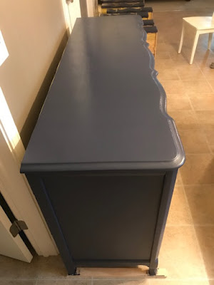
Next came time to sand the furniture because that yellow was so not going back in the room. I spent a few days in the garage sanding the dresser- the only thing that is sanded so far- getting rid of the yellow. Once it was done, I brought it inside to paint. One thing I didn't think of when I swapped out the wall paint color to the darker gray was that I picked the color for the dresser to "go with" the duvet cover but also to have contrast with the wall color. Now that I went much darker, the darker color of the furniture paint isn't so different. I mean, I still love them both but the dresser isn't much darker than the walls now so they blend a little more than I would have hoped.
Here are some progress photos of the dresser.


The color is a grayish navy blue. It also goes with my love of thunderstorms. It's a really deep color in person and it's very pretty. The lighting in the above photos makes it a little brighter than it really is.
I brought the drawers up to see what they looked like with the wall color.

See what I mean when I say they are very similar to each other?

And here is the duvet cover. I had a few options for furniture color. I definitely didn't want aqua furniture. I'm OVER aqua. So it was mint, coral, raspberry, or navy. I felt if I went with mint or coral the room would be very girly- almost teenager girly. The raspberry color is really pretty, but I felt decorating the room around that color would be almost impossible. I also try in my house to not make it overly feminine. I mean, aside from the hot pink linen closet, my house is very masculine in colors. I felt the grayish navy was the best option but with the darker furniture, it would ground the room more than the mint/aqua/coral.


This time around all 6 will be on the closet wall- the top photo of these three. I have an idea of what I want in them, I just need to figure out how I'm going to go about it and choosing the photos. Stay tuned.


Comments
Post a Comment
Only comment if you are going to tell me how awesome I am. If you don't, I will hunt you down and cut a bitch.